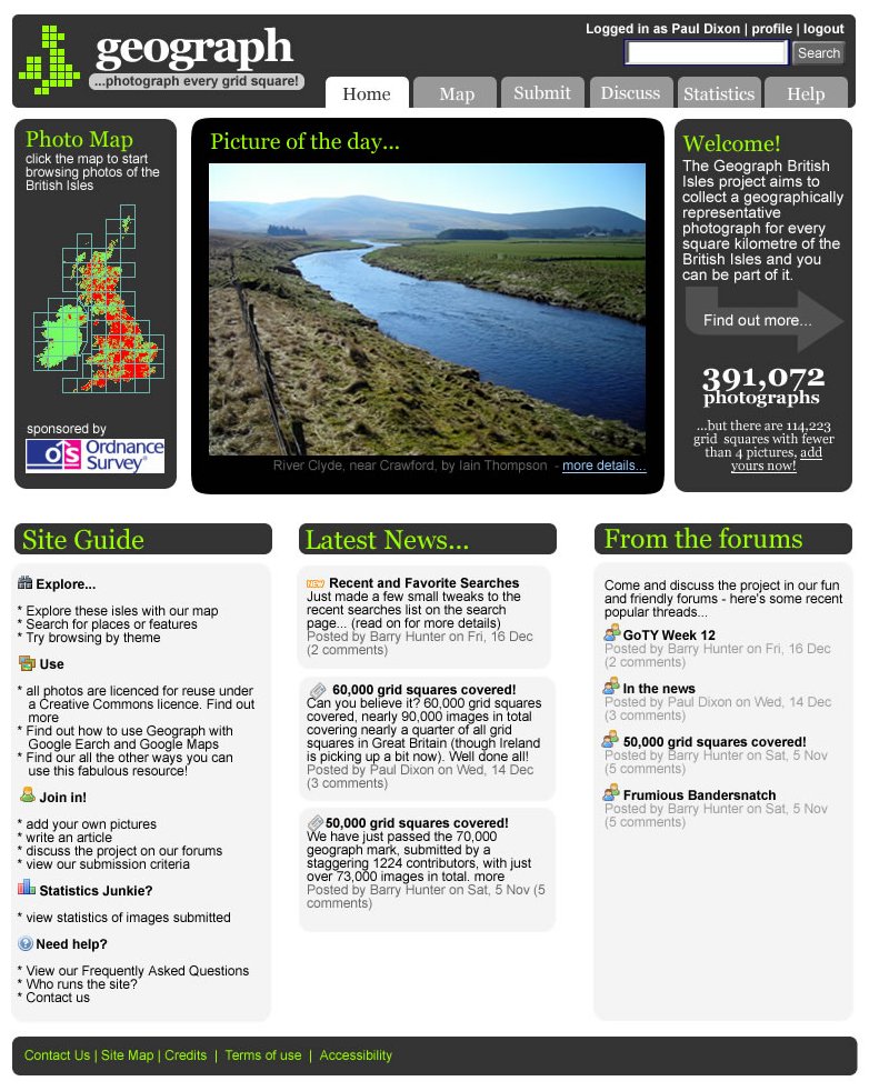
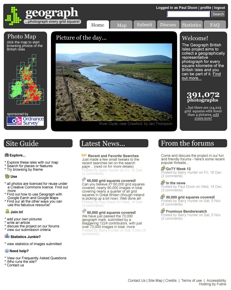
 As the OS liked the design draft I posted here a few days ago, I’m refining it further as a complete freshen up of the design. First up, here’s a slight refinement of the front page. Tried a little colour in the headings and made an attempt to make the lower half of the page look more organised. Not sure if those green headings work though…
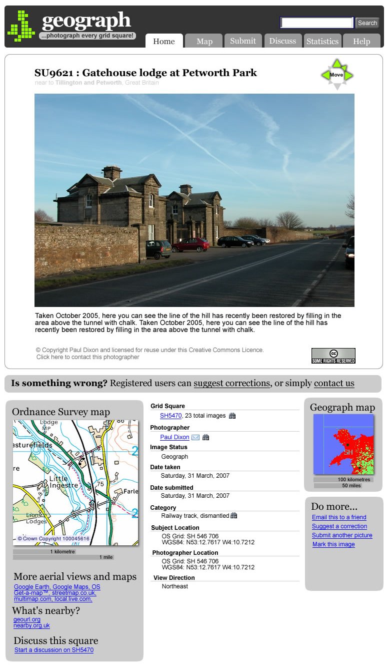
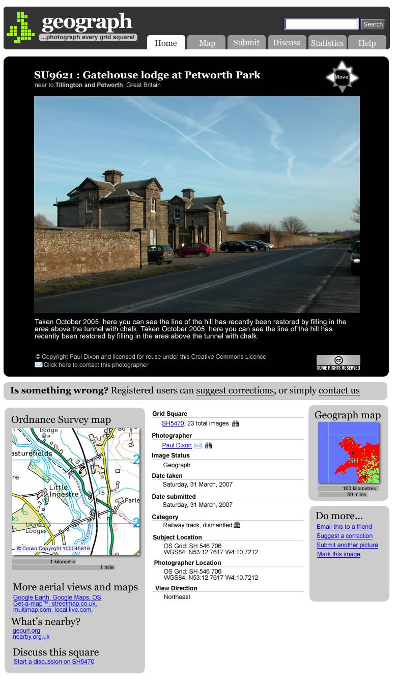 Next up, here’s some treatments for the photo viewing page. This attempts to simplify and organise the links we have on the photo pages, as well as make the black/white/grey backgrounds work a little better into the design. Here’s a version with a white photo background.