I played around with an idea for new geograph design last year, but as the Ordnance Survey would like a revised design for schools use, I’ve dusted it off and worked on it some more…(click for bigness)
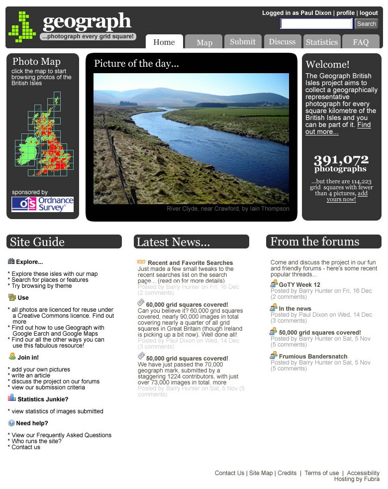
I wanted to get all the important stuff above the fold, so we have the coverage map / entry point, a featured image, and the one-liner mission statement with an image count and call-to-action.
I’ve also dropped the use of Georgia as a body text font – while I think it gives the site a distinctive look, it does look poor at smaller point sizes, and it has caused the odd complaint.
Once that lot has tempted you to explore, the site guide gives you all the main entry points to get you started. As before, we feature recent news but give it a little more prominence centre stage. Finally, it’s time we highlighted the vibrance of the forums by linking to popular threads from the front page (at the same time we’ll most likely drop the need to register to view them – only to post).
Comments are more than welcome…
Very nice indeed, Nice, professional design, and I agree with getting the critical bits to get people interested “above the fold”, then providing plenty of links + info below.
It looks like you’ve managed to strike a balance between getting lots of usable stuff on the homepage and making it too cluttered and offputting too.
I like it. A far ‘cleaner’ look than the current one and the large image certainly grabs attention!
It gets my vote.
Goegraph – major failure or just down for maintenance/upgrade? It’s been unavailable since last night around 2200 13.02.2007. Please advise if at all possible.
Regards
Just had a quick look at geograph, but I can’t seem to find anything. 8:55pm May 25th, 2007.
Probably just a coincidence – but just thought I’d let you know somehow in case you didn’t know!