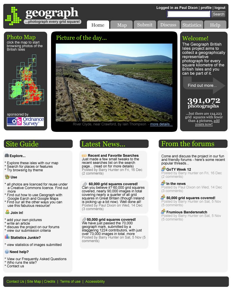
 As the OS liked the design draft I posted here a few days ago, I’m refining it further as a complete freshen up of the design. First up, here’s a slight refinement of the front page. Tried a little colour in the headings and made an attempt to make the lower half of the page look more organised. Not sure if those green headings work though…
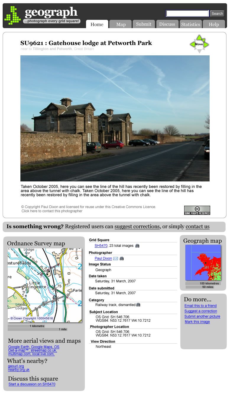
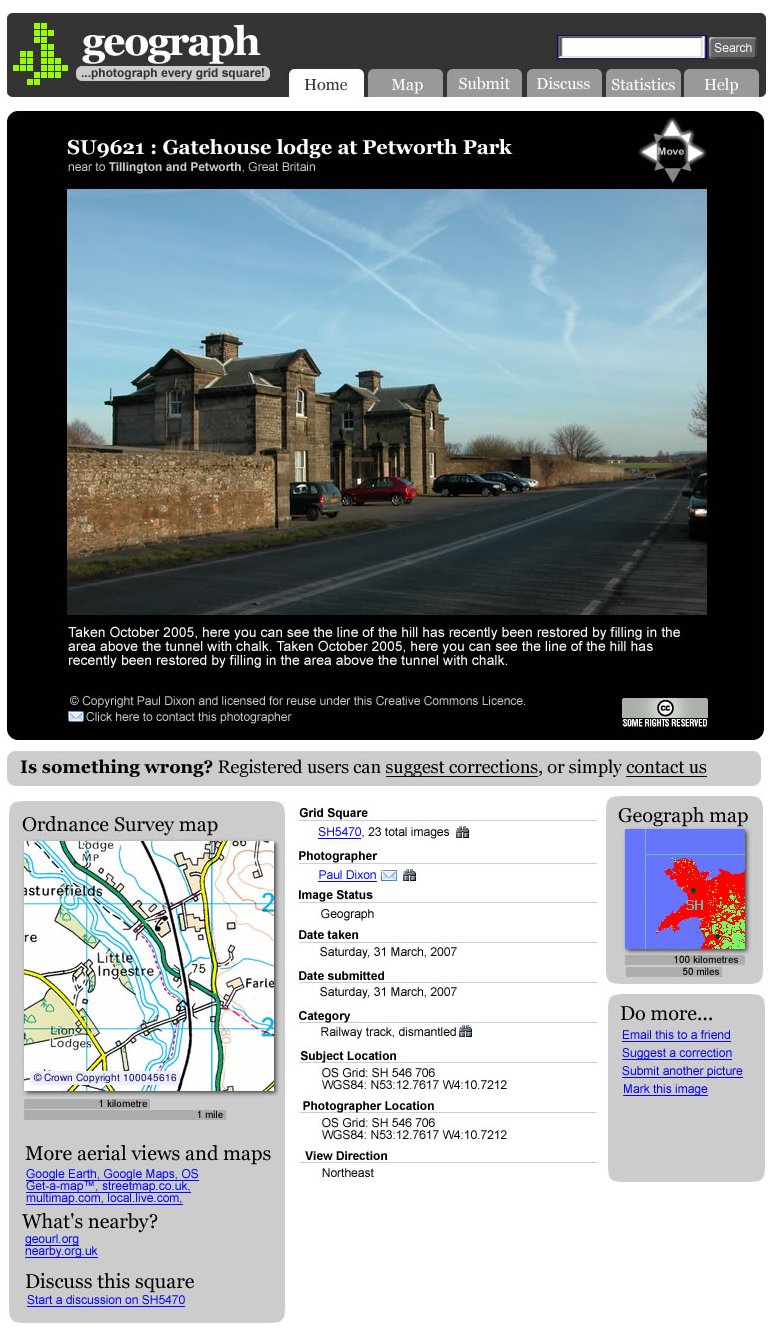 Next up, here’s some treatments for the photo viewing page. This attempts to simplify and organise the links we have on the photo pages, as well as make the black/white/grey backgrounds work a little better into the design. Here’s a version with a white photo background.
If the black section around the photo is meant to be slightly larger than the outerlying gray sidebar sections, I think it should be more prominantly larger. If not, and it’s simply an effect of the art program you’re using to create your mockup – then ok. 😛
I think with your grayscale theme, a border around the photo (perhaps a 1px silver?) might add some nice contrast. I also prefer the black background for the photo viewing page.
Because the word “geograph” is not in green, it throws off the coloring for the headers being green. If it must be worked in, I think that perhaps the “Find out more” arrow could possibly be that shade of green and still work, but it’s such a vibrant color, it might be overpowering if used too much in this theme.
FYI — I really like the design as well. It’s very clean and simplistic.
Thanks for that. Pretty sure those green headers will be gone in the next draft 🙂
At the moment everything has been positioned roughly by eye too, but now you’ve noticed it, I’ll fettle that up too in the next version!
Ah, I almost forgot (ok, I did forget which is why I’m posting twice, sorry). You seem to be using two different colors as the faded gray under the feeded content (forum posts, news posts, etc…), or it could be an optical illusion, or just a poor JPG export. Regardless, you’ll want to be careful how similar this foreground text color is to the background so that you don’t go against accessibility concerns (which I’m sure you’re aware of, but at this point in the design I wanted to mention it).
Very nice looking redesign, will definitely be a big improvement when it goes live. You don’t happen to be pushing it live now, by the way? I notice the Geograph website is down with a 503 error…
We had some kind of outage earlier on Geograph, not sure yet what caused it
The green headings don’t bother me at all.
I really like the redesign but on the photo viewing page I think the image would benefit from a narrow border especially with the black background where the dark colours at the edge of the photo tend to merge into the background. Similarly I expect light colours would merge into a white background. Hope you don’t think I’m being picky as generally the design is great and looks very professional.