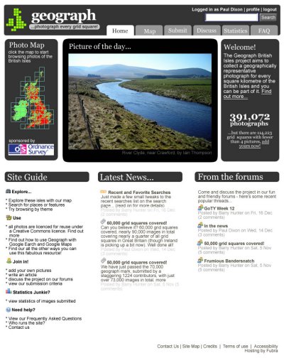
I played around with an idea for new geograph design last year, but as the Ordnance Survey would like a revised design for schools use, I’ve dusted it off and worked on it some more…(click for bigness)
I wanted to get all the important stuff above the fold, so we have the coverage map / entry point, a featured image, and the one-liner mission statement with an image count and call-to-action.
I’ve also dropped the use of Georgia as a body text font – while I think it gives the site a distinctive look, it does look poor at smaller point sizes, and it has caused the odd complaint.
Once that lot has tempted you to explore, the site guide gives you all the main entry points to get you started. As before, we feature recent news but give it a little more prominence centre stage. Finally, it’s time we highlighted the vibrance of the forums by linking to popular threads from the front page (at the same time we’ll most likely drop the need to register to view them – only to post).
Comments are more than welcome…

 Been a bit lax in attending the